The Reliable Source For Everything Digital Income. From Using ClickFunnels for Blogging, Vlogging, to Social Media Marketing Agency and Much More.
High Converting Lead Capture Page - Lead Capture Page Anatomy in 2020
Get link
Facebook
X
Pinterest
Email
Other Apps
In this article "High Converting Lead Capture Page", we'll be talking about the anatomy of a high converting form. In other words, what is it that separates good forms from great forms. I'll be showing with you a case study on a form that I built over three years ago that's been converting 40.6%. What's really surprising about this form is that it shouldn't convert so well. It's a really ugly looking form and it's it really surprised me to see it converting so well. So I'll dig into some of the insights around why I believe it's converting so well. And how you can apply them to your lead capture forms so that you can capture more leads.
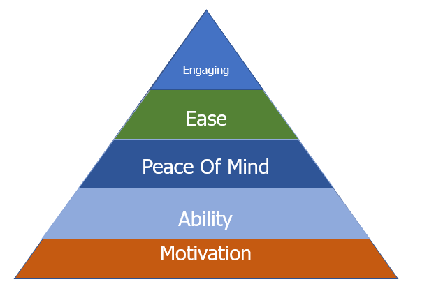
High Converting Lead Capture Page: The Optimization Pyramid
High Converting Lead Capture Page - Form Optimization Pyramid
To understand what separates good forms from great forms; I want to introduce you to a concept that we came up with called the form optimization pyramid. This is a kind of hierarchy of needs applied to forms. There are five different factors that we found to influence how well our forum performs.
High Converting Lead Capture Page: Motivation
Starting with motivation: the foundation of this pyramid is how motivated your users are to fill out your forms. When we think about this; people don't fill out forms to generate leads for your business; people are trying to achieve some kind of outcome. Behind this action of using your form, there's a degree of motivation: they're trying to achieve something. The strength of that motivation or the intensity of that motivation has a huge impact on your conversion rate. A good example of this would be if you were to hypothetically give away a free Ferrari to everyone that used your form. You would probably have 100% conversion rate. Because the motivation and the desire to use the form would be so high. You wouldn't then need to worry about things like usability and design as much. Because people would be so motivated to fill out the form.
High Converting Lead Capture Page: Ability
Next, we have the ability. This is whether people can physically use your form. It is not just technical things like bugs I'm also talking about things like if you're using if use the form on a mobile device out in the sunshine. Can people actually see the fields or are the colour too light? can colour black people who are colourblind use itis it accessible to people who are deaf or blind? or various other disabilities. All of these things impact accessibility and whether people can actually use your forms.
High Converting Lead Capture Page: Peace Of Mind
The next layer is a peace of mind. As an example a couple of days ago is using a form that asked for my address. When it had no reason really to ask my address. I started to think: okay; well does this mean that these guys are going to be sending me things in the post? why am I being asked to give my address? That's peace of mind like are things that you're asking your users that are causing them to question why you're asking them. Or other things that might impede on whether people would trust your website or filling out your forms.
High Converting Lead Capture Page: Ease
The next thing is ease. This is when we get into things like reducing the number of questions that are being asked. The fewer questions that we're asking or they're easier is to fill out the forms the higher our conversion rate is going to be generally speaking. There are also things here like changing the question types to make them easier.
One thing that we use a lot in the lead forms is using image select questions where the user just has to click an image to answer that question. These are much better than a dropdown question. Because photo drop-down you'd have to click the drop-down box, select the answer, and then click out of the drop-down box, which means you have to click three times to answer one question. Whereas with image selection, you just need to click once so that reduces the cognitive load.. making it easier.
High Converting Lead Capture Page: Engagement
The final part of the pyramid engagement. This is what really separates good forms from great forms. Most forms are not very engaging and it might seem a bit unusual to use a word like engagement and applying it to forms. Some of the best forms that I've seen, don't actually look like forms, they don't feel like forms. they feel more like tools or quizzes.
This is kind of in my mind the pinnacle of lead capture form design. Engagement is really about creating a form that almost feels more like an engaging experience for the end-user. Where perhaps it feels more like they're using a tool or filling out a quiz. When we think about it, a quiz is really it's really just a form that has been made engaging and fun and people pay for quizzes. Ultimately it's still just a form that you're filling out to then achieve an outcome for fun. Making forms more quiz-like or gamified; that is from my experience looking at studying all these high combining forms; is what separates the good forms from the great forms.
A Case Study
Let's look at an example of this: about three years ago I built a website which is just a fun app that people can use to measure the size of their comfort zones. When I built this website I really wasn't thinking about conversion. I whipped up this lead capture form which had 30 questions and it was really bad design honestly looked like it came from the 90s. I was kind of expecting maybe this would come to convert around 2-3%. Nothing very average based on the number of questions I was asking and how bad the form looked.
Why The "Comfort Zone Calculator" Performed Well
I realized that this form was converting it over forty per cent and over the past three years the average conversion rate's been 40%. Which means that almost one in two people that visit the website use this form. Which as I said has over 30 questions and takes I believe. The average time using this form is, about six minutes. It's not an easy form to use yet so many people use it. Why? well, the things I just mentioned in the form optimization pyramid.
Motivation
It really gets that first one right there's a really high degree of motivation to use this form because people are really curious about it. When people hear about a comfort zone calculator, they want to know what their comfort zone, what the compass own score is. Perhaps if they see a link on twitter from one of their friends that have just used this tool. They're really curious to see how they compare to their friend. There's a really surprisingly strong degree of motivation to use this tool.
Ability
Although I said the design doesn't look very nice. it's very usable and not unintentionally it does work with many of the best accessibility practices. So you're able to use it as an end-user.
Peace Of Mind
And then the next phase peace of mind this is an area that we score worst on. Because we were actually asking questions like annual income, phone number, email address. a lot of sensitive information that we really perhaps didn't need to ask. Which perhaps kind of hindered our conversion rate slightly. But because the motivation was so high I think people were then happy to provide us with this information.
Ease
The next phase is what we certainly didn't make it easy. This was a very long form. But again because we got them because we got those core parts of the form right I believe that that kind of counter countered the ease of the form.
Engagement
Then finally engagement: more engagement we got I think we did really well. Because the user was getting instant value from using our form, they were receiving their comfort zone score. which they had a strong motivation to find out because of their curiosity. I don't think people really use this thinking of it as a lead-capture form. It very much felt like a quiz or a kind of a tool that people were using to learn something about themselves. Because we were providing immediate values of the users. It felt less like a lead capture form.. and I think that's one of the reasons why it converted so well.
Use Tools Not Forms!
That's something I've learnt and seen more and moreover, the past few years is organizations using these quiz like tools like lead capture. I know Hubspot have their marketing grader which I believe converts very well compare the market. Many insurance companies have these instant quote generators. Which again work really well I'm starting to see a lot of broadband and energy companies building them as well. I believe this is kind of where lead capture forms are heading. Perhaps two or three years I don't think we're going to see so many of those boxes asking for name email phone number. I think it's going to be more engaging giving the users immediate value forgiving their information.
So I hope that's been really useful. If you want to dive a bit deeper there's a lot more information in the previous article about lead magnet ideas. Remember to leave us a comment in the comments below and take a second to follow me on twitter for your daily update.
You know that feeling. You've poured your heart and soul into creating a fantastic product. You've built a website, maybe even spent a fortune on ads, and yet... sales are sluggish. You're barely breaking even, let alone turning a profit. Sound familiar? This is where most online businesses fall short. They focus on the initial sale, like McDonalds selling a single burger. But just like the fast-food giant knows, the real money lies in the upsells – the fries, the drinks, the super-sized combos. Claim Your Free Trial The Power of Sales Funnels Online, this "upselling" happens through sales funnels . Imagine this: Step 1: Capture Page: Visitors land on a page where they exchange their email address for valuable content (like a free ebook or video). Step 2: Sales Page: You present your core product with compelling offers and persuasive copy. Step 3: Upsell/Downsell Pages: Offer upgrades, related products, or more affordable options to maximize your revenue pe...
Digital income funnels refer to a strategic approach to generating revenue online by guiding potential customers through a series of steps or stages with the ultimate goal of converting them into paying customers. These funnels typically involve multiple touchpoints, such as advertisements, content marketing, email sequences, and sales pages, designed to nurture leads and drive sales. Here's a simplified breakdown of a typical digital income funnel: 1. Awareness: Attract potential customers' attention through various channels like social media, SEO-optimized content, paid ads, or influencer marketing. 2. Interest: Once people are aware of your brand, provide valuable content, free resources, or engaging materials to spark their interest. This could be in the form of blog posts, videos, webinars, or lead magnets (e-books, checklists, etc.) in exchange for their email addresses. 3. Consideration: Nurture the leads gathered by offering more targeted and valuable content. This sta...
In today's fast-paced digital world, finding reliable ways to earn money online can feel like a treasure hunt. Enter ySense , a platform that pays users to complete simple tasks such as surveys, microtasks, and exclusive offers. With over 10,000 users already making money, it’s worth exploring how you can turn your spare time into cash. Why Choose ySense ? 1. Low Difficulty, High Accessibility ySense is designed for people of all backgrounds. Whether you’re a student, stay-at-home parent, or simply looking for extra income, ySense offers a low-barrier entry to earning. The tasks are straightforward, making it easy for anyone to get started. 2. Flexible Earning Potential On average, users can earn up to $10 USD daily , depending on the time and effort they invest. Spending just 1 to 2 hours per day can translate into meaningful supplementary income over time. 3. Work on Your Schedule One of the biggest advantages of ySense is its flexibility. You’re not tied to a specific sched...
Comments
Post a Comment